Redesigning the Campaign Creation Flow
What I Achieved
Overview
Apxor's Campaign Creation Flow is one of the platform's most critical workflows, enabling customers to design, target, schedule, review, and publish nudges.
Over time, the dashboard became difficult to maintain and scale due to an outdated UI, technical limitations, and multiple UX issues that directly impacted customer productivity. These challenges increased CSM support dependency, created frustration among enterprise customers, and became a factor in customers evaluating competitor platforms.
My Work
Stakeholder Interviews (CSM & Sales), Heuristic Evaluation, IA, Design, Cross-functional Collaboration,
Team

- Panchala Karthik , Product Designer
Time Line
6 to 8 Months
I didn't start with the UI
Before touching Figma, I sat with the CSM and Sales teams. They were closest to the pain. CSMs were fielding confused calls daily, and sales was hearing "your competitor's tool is simpler" in demos. That context shaped everything.
Four Problems One broken workflow.
The campaign creation flow has three steps:
Design → Target → Schedule, then Review and Publish.
All four problems concentrated in the Design step the very first thing users touched.
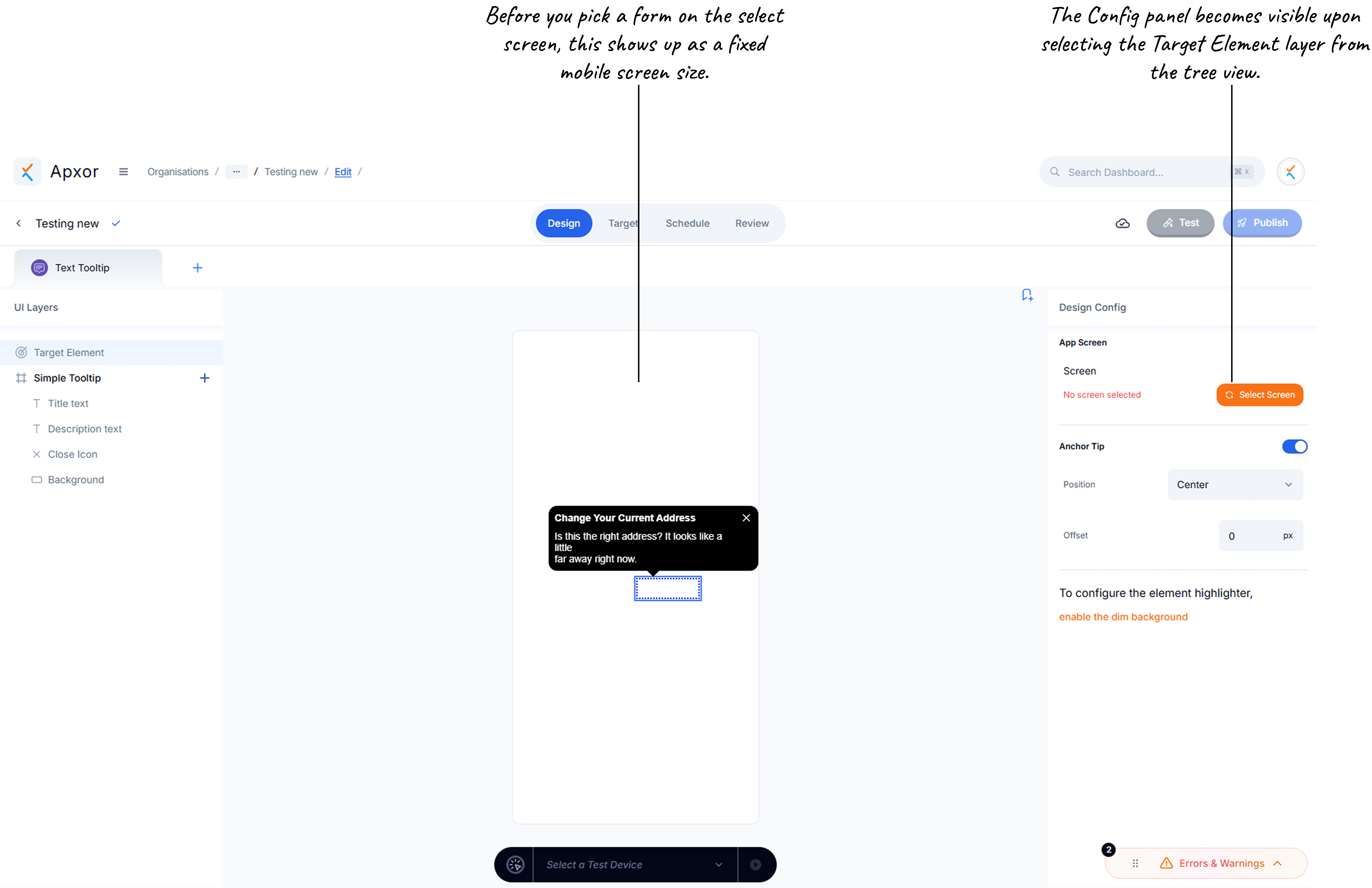
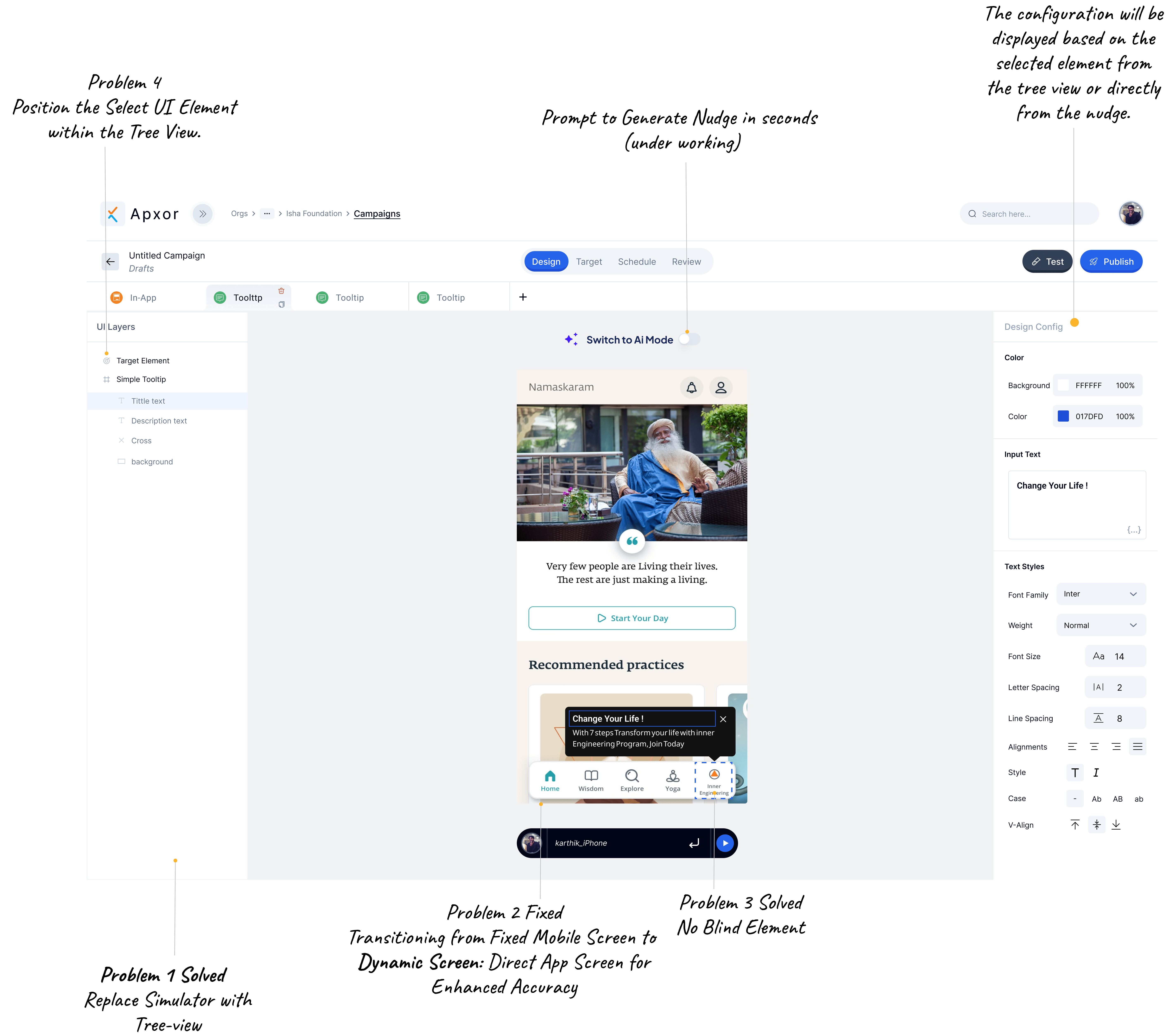
Problem 1. No element hierarchy in the design canvas
Users couldn't reliably select what they wanted to edit
A nudge contains multiple elements background, title, description, buttons, images, close icon. All of them lived on a single flat canvas. Click on the title and the description would get highlighted. There was no tree view, no parent-child structure, no way to directly select an element without hunting for it.
Problem 2. Fixed mobile frame created false previews
What you designed ≠ what users saw on real devices
The design canvas used a fixed mobile boundary approximately 360×720px. But enterprise clients use iPhones, Samsung, and other modern devices that are significantly larger. A nudge positioned at the edge of the canvas would overflow the screen entirely on a real device.
This created a constant loop: design, Preview, check on device, go back, adjust, repeat. Every campaign took far longer than it should, and users stopped trusting their previews.
Problem 3: Designing blind no real screen context
Users had to imagine how the nudge would look in the app
The preview simulator showed a mobile screen short of the preview. Users were expected to mentally picture how their nudge would overlay on their own app's UI a cognitive leap that led to poorly positioned nudges, mismatched colors, and constant surprises post-launch.
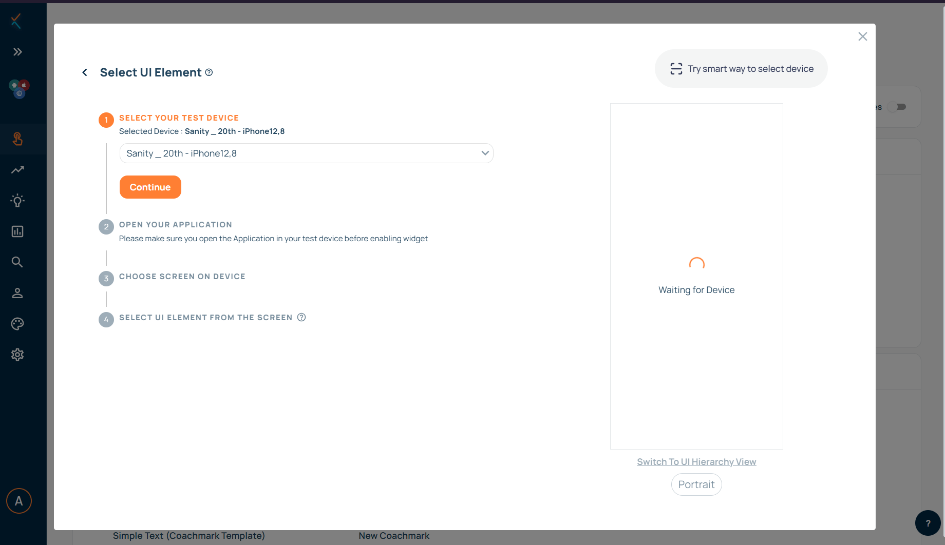
Problem 4: Cast mobile screen was a dead end
Users got stuck before they could even start design/previewing the nudge.
To preview a nudge on a real device, users connected their phone through a multi-step flow. This broke silently in multiple ways: uninstalling the app left ghost devices in the dropdown; clearing the cache disconnected without warning; bundle ID mismatches failed with no explanation; app updates broke existing connections.
Users had no idea why the connection failed or what to do next. Every failure ended with a support ticket to the CSM team.
Current Design
Solution
Four decisions that changed the flow
Solution 01 → Problem 01
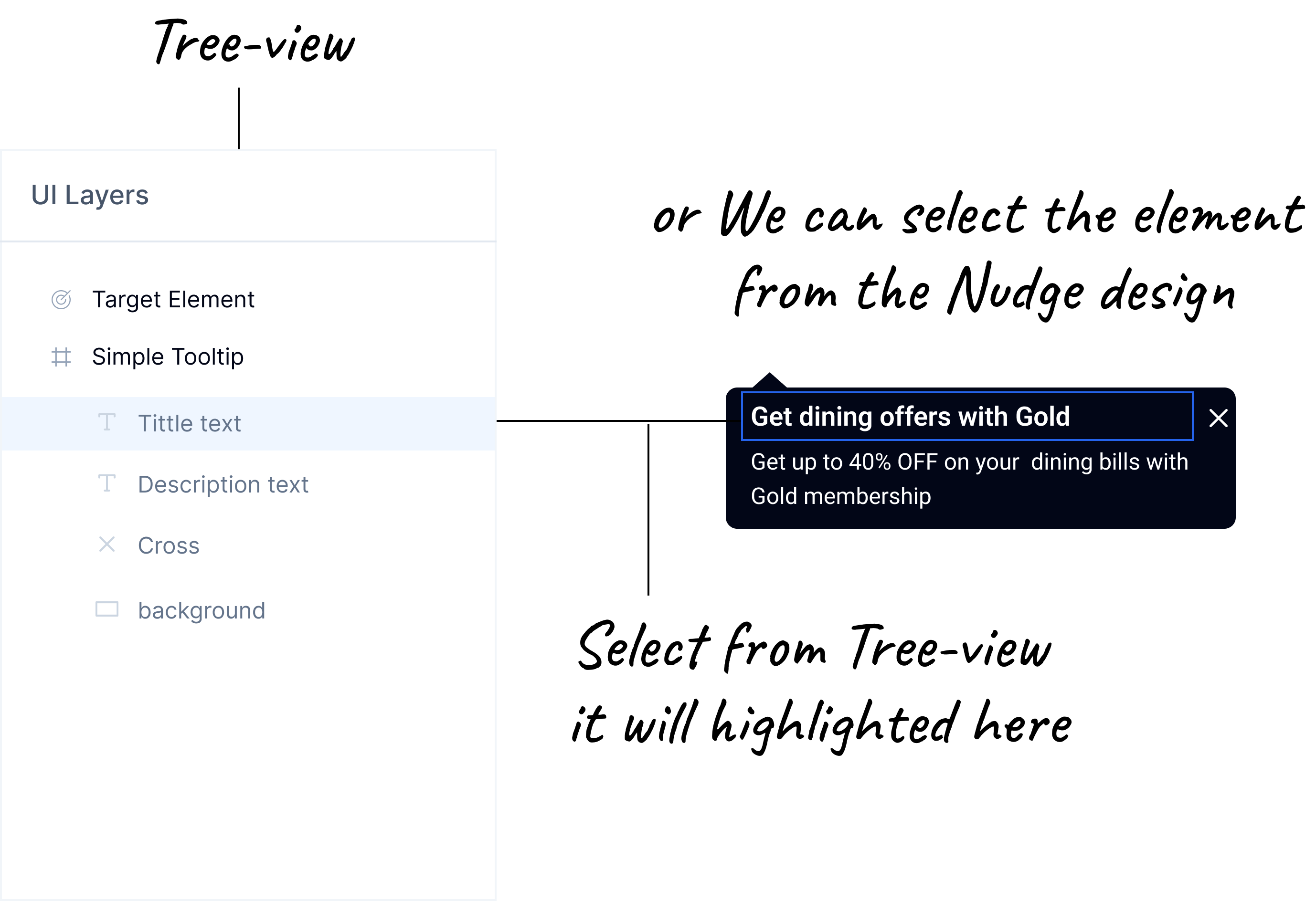
Tree View replaced the simulator
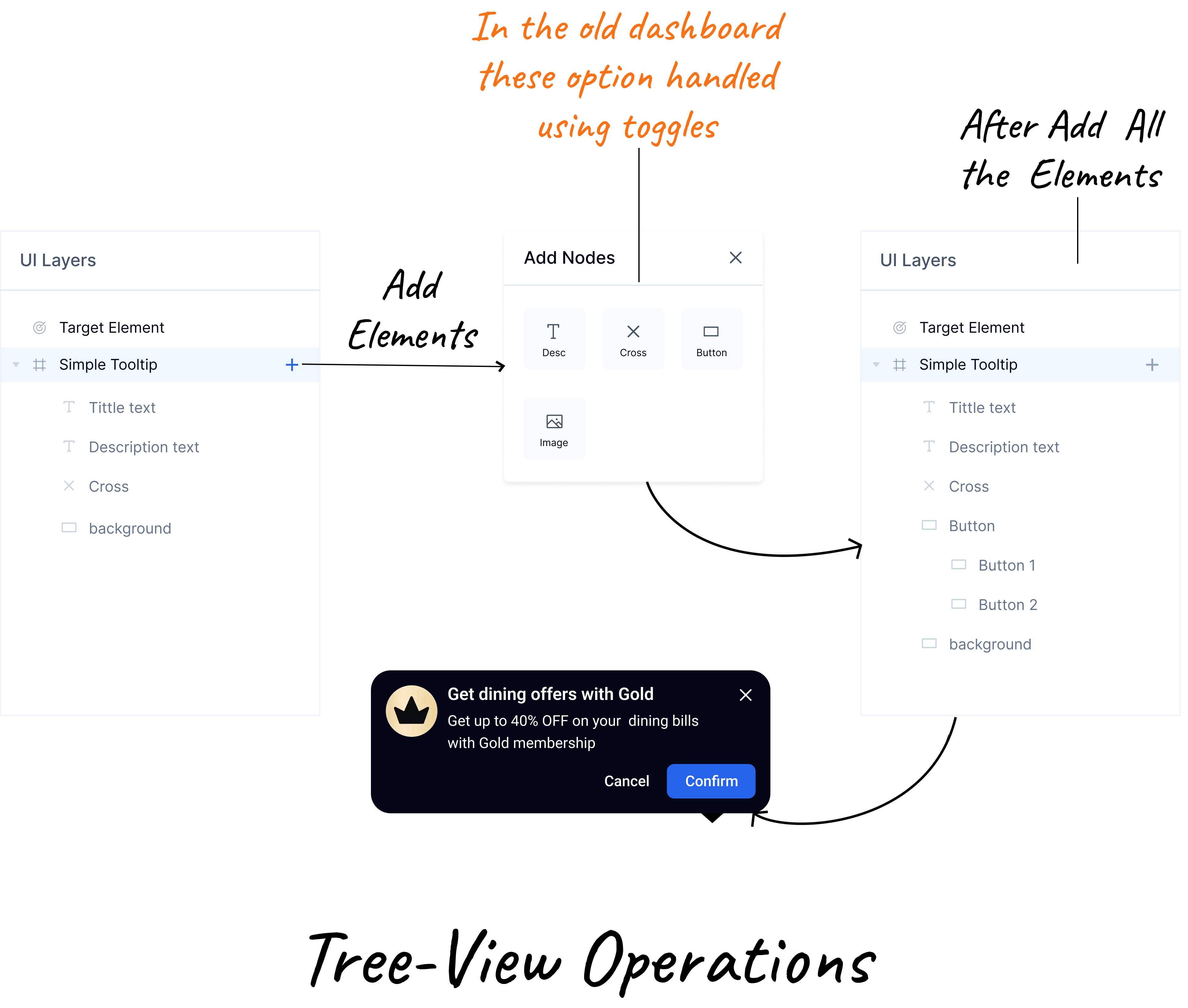
I made a deliberate product tradeoff: remove the auto-screenshot simulator and use that left panel for a Figma-style tree view. Every element in the nudge now has a named row in the hierarchy. Clicking any element selects it, highlights it in the canvas, and loads its configuration in the right panel simultaneously. And we improved direct click on Canvas element behavior also
This eliminated the selection confusion entirely. Users now work with structure
Product Decision
The Simulator was originally introduced to display the current app screen inside a mobile preview, allowing users to design in context using a live screenshot of the app. However, after solving Problem 2 by bringing the user's screen directly into the design canvas, the Simulator no longer provided additional value it became a duplicate view of the same content.
To make better use of the available space, I removed the Simulator and replaced it with a Tree View. Unlike the Simulator, which was passive and only showed a preview, the Tree View actively supports the design process by helping users navigate, select, and manage screen elements more efficiently. This transformed the same screen real estate into a higher-value workspace that improves design speed and control.
Simulator View Replaced with Tree-view
Solution 02 → Problem 02
Device dimensions, not fixed frames
When a developer registers their device as a test device, the system now captures the actual screen dimensions and uses them to render the mobile boundary in the design canvas. If you're testing on a Samsung S24 Ultra, the canvas matches it exactly.
No more designing for a 360px frame and previewing on a 430px device. What you see in the editor is what renders on the device.
The screen captured during the Select UI Element step is reused directly in the design canvas. This allows users to feel like they are designing on the actual app screen rather than a separate preview, providing a more contextual and accurate design experience while making it easier to visualize changes in the real App.
Solution 03 → Problem 03
Design on the actual app screen
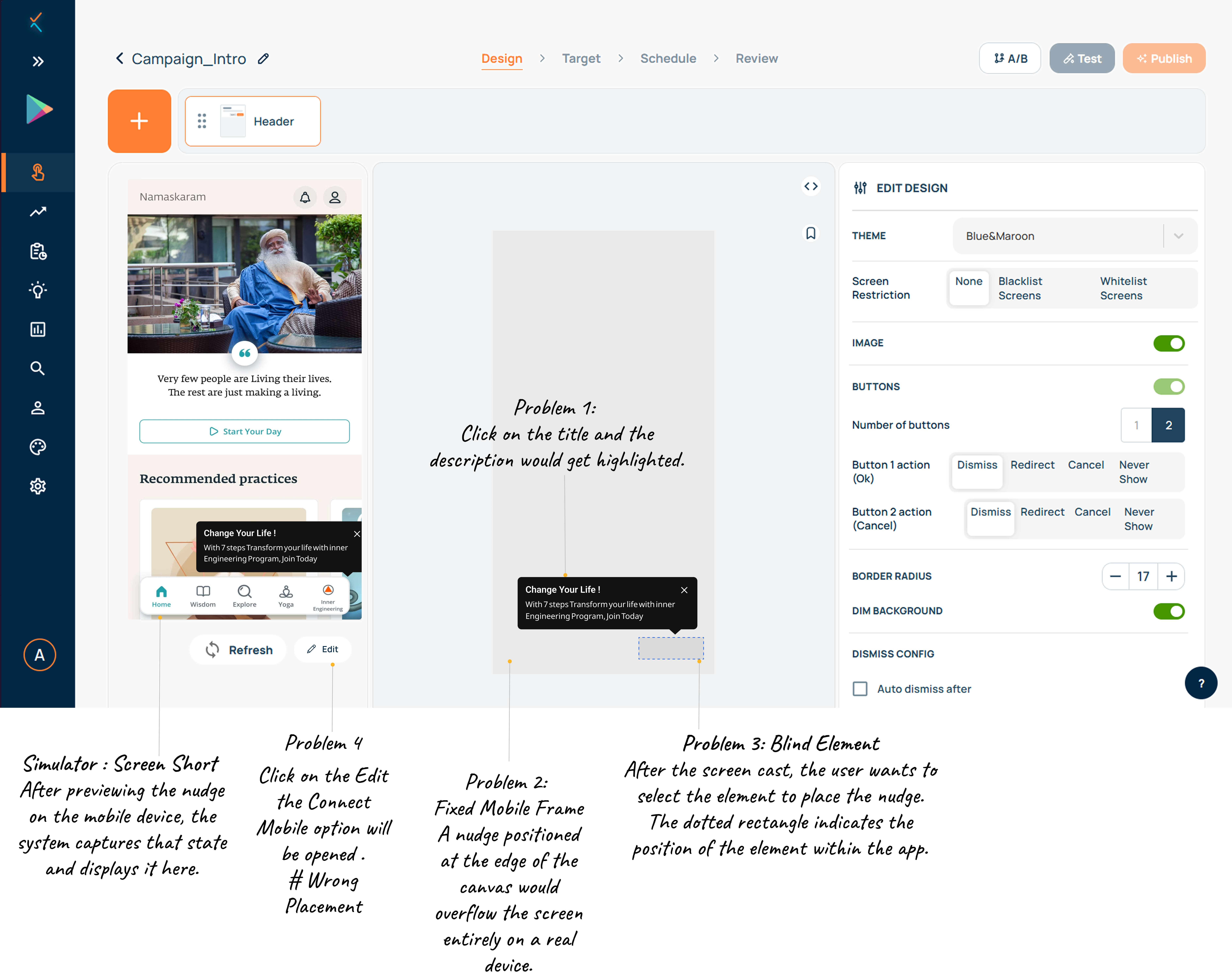
When a user connects their device, the system captures a screenshot of their app's current screen. That screenshot is then displayed inside the nudge design canvas as the background. You're no longer designing against a blank mobile outline.
You're placing your nudge directly on top of your own app. The colors, contrast, positioning all evaluated in real context before you publish a single campaign.
Why this matters
This isn't just a visual improvement. It changes the mental model entirely. Instead of imagining how the nudge will look in the app, you're designing in the app. It removes the last gap between design and reality.
Final Design
Solution 04 → Problem 04
Scan-to-Connect one QR, zero steps
The old connection flow required users to pick a device from a dropdown, figure out if it was still registered, check bundle IDs manually, and hope the SSE connection established. Every edge case uninstalled app, cleared cache, app update caused silent failures.
I replaced the entire flow with a single QR scan. Scanning handles everything automatically:
Design Principle
Every user knows how to scan a QR code. The old flow required users to understand registration logic, bundle IDs, and SSE connections. Good connectivity UX is invisible.
Old Design
New Flow